Introduction
Android allows you to set the appearance of your application using themes. A theme specifies default colors, fonts, and images, for an Android activity or an entire application. Your application can use the device's built-in themes, or include custom themes. By default, Titanium applications use a custom theme called Titanium for their main activity. This theme defines the splash screen when the application starts, but otherwise defers to a device default theme. This theme is based on the AppCompat theme with a translucent background.
To update the look of your application, you can either:
- Use a different built-in Android theme
- Use a Titanium-defined theme
- Create a custom theme and define the elements you want to change
- Use the Android Material Theme to quickly customize the theme's color palette
- Use third-party tools to help you generate a custom theme
You can specify a unique theme per window or per activity.
Android themes
Android provides some built-in themes to easily change the overall appearance
of your application. To use a built-in theme, you need to create a theme
XML file for your project, specify the built-in theme you want to use,
and reference it in the Android manifest section of your tiapp.xml file.
First, create a theme XML file in ./platform/android/res/values. Do NOT name the file theme.xml. Titanium uses this name as its default theme file, which is required
to build the application. If you create a file called theme.xml, it will overwrite the default Titanium one and break the build process.
In the theme XML file, add the theme you want to use. Themes defined by the Android system, excluding the AppCompat ones, are prefaced with @android:style (for example, @android:style/Theme.Translucent). Custom themes defined by the application are prefaced with @style (for example, @style/Theme.MyTheme). For example, the file below adds support for some of the common built-in Android themes.
The Titanium SDK uses the appcompat library to provide support for themes. A benefit of using the appcompat library is that it provides ActionBar support on devices running Android 2.1.x and later. Prior to the usage of the appcompat library, the ActionBar was only available to devices running Android 3.x and later. Note that applications can only use the AppCompat themes.
|
1
2
3
4
5
6
|
<?xml version="1.0" encoding="utf-8"?> <style name="LightDarkBar" parent="Theme.AppCompat.Light.DarkActionBar"/> <style name="Light" parent="Theme.AppCompat.Light"/> <style name="Dark" parent="Theme.AppCompat"/></resources> |
Finally, to use a theme in your application, modify the Android section
of your tiapp.xml file to reference the style name you want to use:
|
1
2
3
4
5
|
<manifest> <application android:theme="@style/LightDarkBar"/> </manifest></android> |
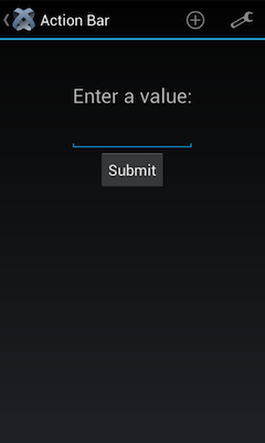
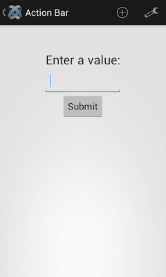
The screenshots below show the difference between the various built-in themes:
|
AppCompat.Light |
AppCompat/Holo
|
AppCompat.Light.DarkActionBar
|
|---|---|---|
 |
 |
 |
Titanium themes
The Titanium SDK includes a few predefined themes. You can use these themes in your application rather than creating your own.
NOTE: Do not create a theme with the same name as a predefined theme.
|
Theme Name
|
SDK Version
|
Description
|
|---|---|---|
| Theme.Titanium | * |
Theme based off the Android SDK's default AppCompat theme with the splash screen image as the default background. Prior to 3.3.0, displays the title bar. Since 3.3.0 and later, hides the action and title bar. |
| Theme.AppCompat.Translucent | 3.4.0 | Theme based off the AppCompat theme with a transparent background and a solid action bar |
| Theme.AppCompat.Translucent.NoTitleBar | 3.4.0 | Same as Theme.AppCompat.Translucent but with no action or title bar. |
| Theme.AppCompat.Translucent.NoTitleBar.Fullscreen | 3.4.0 | Same as Theme.AppCompat.Translucent.NoTitleBar but the window is fullscreen (covers the status bar). |
| Theme.AppCompat.Fullscreen | 3.4.0 | Theme based off the AppCompat theme with a fullscreen window (covers the status bar) with no action or title bar. |
|
Theme.AppCompat.NoTitleBar |
4.2.0 | Theme based off the AppCompat theme with no action and title bar. |
|
Theme.AppCompat.NoTitleBar.Fullscreen |
4.2.0 | Same as Theme.AppCompat.NoTitleBar with a fullscreen window (covers the status bar). |
To apply a theme globally, in the tiapp.xml file, set the android:theme attribute to the theme name in the application element of the Android manifest section.
|
1
2
3
4
5
|
<manifest> <application android:theme="@style/Theme.AppCompat.Translucent"/> </manifest></android> |
To change the theme on a per-window basis, set the theme name to the Window's theme property (available since Release 3.4.0).
NOTE: This method sets the theme for a window dynamically. In native Android
doing so with a theme that has not been set for a particular Activity in
the Manifest and a translucent background results in unstable behavior
on different devices or OS versions. For instance the window may be solid
black color and not showing any content. It is discouraged to use such
themes dynamically.
var win = Ti.UI.createWindow({theme: "Theme.AppCompat.Fullscreen"}); |
Custom themes
To define custom themes, place the theme XML files with your custom styles
in the platform/android/res/values folder. Do NOT name the file theme.xml. Titanium uses this name as its default theme file, which is required
to build the application. If you create a file called theme.xml, it will overwrite the default Titanium one and break the build process.
Note that you can also define version-specific themes by adding a values-v<version> folder. For example a theme defined in values-v11 will be used for API level 11 (3.0/Honeycomb) and above, and a theme
defined in values-v14 will be used for API level 14 (4.0/Ice Cream Sandwich) and above.
For example, if you want your theme to be based on the Light theme, create the following theme file:
|
1
2
3
4
5
6
7
8
9
10
11
12
13
14
15
16
17
18
19
20
21
22
23
24
25
|
<?xml version="1.0" encoding="utf-8"?><resources> <resources> <!-- Define a theme using the AppCompat.Light theme as a base theme
--> <style name="Theme.MyTheme" parent="Theme.AppCompat.Light"> <!-- For Titanium SDK 3.2.x and earlier, use the Holo.Light or Light
theme <style name="Theme.MyTheme" parent="@android:style/Theme.Holo.Light"> --> <!-- Overrides the background color--> <item name="android:windowBackground">@drawable/example</item> <!-- Overrides the default text color --> <item name="android:textColorPrimary">@color/myTextColor</item> <!-- Overrides the default cursor color --> <item name="android:textCursorDrawable">@null</item> <!-- Overrides style for a component with custom one --> <item name="android:buttonStyle">@style/myButtonStyle</item> </style> <!-- Define a style for Buttons as a child of Widget.AppCompat.Button and override the desired properties--> <style name="myButtonStyle" parent="Widget.AppCompat.Button"> <item name="android:minHeight">@dimen/myMinButtonHeight</item> <item name="android:minWidth">@dimen/myMinButtonWidth</item> </style></resources></resources> |
|
1
2
3
4
5
6
7
|
<?xml version="1.0" encoding="utf-8"?><resources> <color name="myBackground">#EE5678</color> <color name="myButton">#39FF21</color> <color name="myTextColor">#0000FF</color> <color name="myButtonTextColor">#FFFF00</color></resources> |
|
1
2
3
4
5
|
<?xml version="1.0" encoding="utf-8"?><resources> <dimen name="myMinButtonWidth">250dp</dimen> <dimen name="myMinButtonHeight">125dp</dimen></resources> |
The theme file above contains two custom style items:
- The first item defines the "Theme.MyTheme" based on the Android
Light theme. The style sets the window background using the image located
at
platform/android/res/drawable/example.png. - The second item overrides the default text color used in the theme. For
convenience all colors can be defined in a separate file located at
platform/android/res/values/colors.xml. - The third item overrides the Light theme's default cursor color for text
fields and uses the TextField's
colorproperty as the cursor color. - The last item overrides the whole style used for buttons. The custom style
is defined in the theme's file as a child of
Widget.AppCompat.Button. In the custom style every property of it can be overriden. In this example the minimum width and height for every button are set to custom values. For convenience dimensions can be defined in a separate file located atplatform/android/res/values/dimens.xml
To use the "Theme.MyTheme" theme in your application, modify
the Android section of your tiapp.xml file:
|
1
2
3
4
5
6
7
8
|
<manifest> <application android:theme="@style/Theme.MyTheme"/> <!-- For the Titanium SDK 3.2.x and earlier, when using the Holo Theme you can only use Android 3.0.x and later --> <uses-sdk android:minSdkVersion="11" android:targetSdkVersion="14"/> </manifest></android> |
Refer to Android Developers: Styles and Themes for detailed information on customizing items.
Material theme
Starting with Release 4.0.0, the Titanium SDK exposes the Material Theme color palette attributes, introduced in Android 5.0 (Lollipop). These attributes allow you to style the status bar, action bar and several control widgets, such as toggle switches and text fields, without having to individually style each component.
To use the Material Theme with Titanium, you need to create a custom theme that extends one of the AppCompat themes, then set the color palette attributes you want to change from the default theme (see the attribute table below). You will need to build your application with Android SDK 5.0 (API 21) and greater. Note that some of the attributes will not be applied when the application is ran on devices running previous versions of Android (pre-Lollipop) (see the comparison table below).
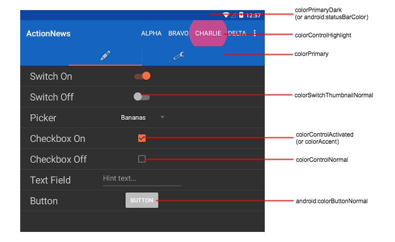
|
Color Palette Attribute
|
Description
|
|---|---|
colorPrimaryDark |
Sets the color of the status bar. Only works with Android 5.0 (API 21) and greater. |
colorPrimary |
Sets the color of the action bar. |
|
|
Sets the accent color, which is usually the color of the control when it is activated. |
|
|
Sets the color of the control when it is not activated. |
|
|
Sets the color when the control is activated. Overwrites the colorAccent attribute. |
|
|
Sets the color when the user clicks on a control. Only works with Android 5.0 (API 21) and greater. |
|
|
Sets the color of a toggle switch's thumb when it is not enabled. Only works with Android 5.0 (API 21) and greater. |
android:colorButtonNormal |
Sets the color of a button when it is not pressed. Only works with Android 5.0 (API 21) and greater. |
android:colorEdgeEffect |
Sets the edge effect color when the user tries to scroll beyond the content's boundaries. Only works with Android 5.0 (API 21) and greater. |
|
|
Sets the color of the navigation bar (the bar that appears at the bottom of the device that contains the Back, Home and Recent App buttons). Only works with Android 5.0 (API 21) and greater. |
|
|
Sets the color of text on controls. Prior to Android 5.0, this only sets the color of the action bar title and overflow menu. |
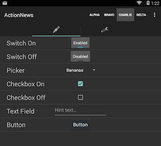
Example
The following XML file below defines a theme that uses the default AppCompat theme and applies additional color palette attributes. This theme was applied to the application in the previous screen shot.
|
1
2
3
4
5
6
7
8
9
10
11
12
13
14
|
<?xml version="1.0" encoding="utf-8"?><resources> <style name="materialTheme" parent="@style/Theme.AppCompat"> <item name="colorPrimary">#1565C0</item> <item name="colorPrimaryDark">#0D47A1</item> <item name="colorAccent">#FF80AB</item> <item name="colorControlNormal">#757575</item> <item name="colorControlActivated">#FF6E40</item> <item name="colorControlHighlight">#FF4081</item> <item name="colorSwitchThumbNormal">#BDBDBD</item> <item name="android:colorButtonNormal">#BDBDBD</item> <item name="android:colorEdgeEffect">#FF4081</item> </style></resources> |
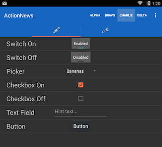
Theme comparison
The following table compares the same application when using different Android versions and themes. Note that the Android 4.4. screenshots use the old style toggle button due to Android bug #78262.
|
Example Material Theme / Android 5.0
|
Example Material Theme / Android 4.4
|
Default AppCompat / Android 4.4
|
|---|---|---|
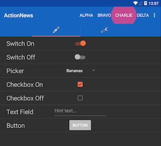 |
 |
 |
Material theme further reading
- Android Developer: Using Material Theme
- Android Developers Blog: AppCompat v21 — Material Design for Pre-Lollipop Devices!
- Google Design Guidelines: Style - Color
Override a theme
If you have a global theme set, the application can override the theme for a window or activity, or if you want to specify a custom theme for a specific window or activity.
Override a window theme
Starting with Release 3.4.0, the Titanium SDK exposes the theme property for Windows. Use the theme property to override the global theme for an individual window. Set the
property to the name of the theme you want to apply to the window. The
property can only be set when creating the Window object and cannot be
changed after it is set.
NOTE: This method sets the theme for a window dynamically. In native Android
doing so with a theme that has not been set for a particular Activity in
the Manifest and a translucent background results in unstable behavior
on different devices or OS versions. For instance the window may be solid
black color and not showing any content. It is discouraged to use such
themes dynamically.
var win = Ti.UI.createWindow({theme: "Theme.AppCompat.Fullscreen"}); |
Override an activity theme
As you can see in the previous examples, an application-wide theme can
be specified in the <application> element of your tiapp.xml file, but it can also be overridden on a per-activity basis. These activities
are defined in the AndroidManifest.xml file, generated by the build process. You can find the generated
AndroidManifest.xml file in the build/android folder under your project folder. Inside the AndroidManifest.xml, you'll find code like this:
|
1
2
3
4
5
6
7
8
9
10
11
12
13
|
<activity android:name=".ThemetestActivity" android:label="ThemeTest" android:theme="@style/Theme.Titanium" android:configChanges="keyboardHidden|orientation"> <intent-filter> <action android:name="android.intent.action.MAIN" /> <category android:name="android.intent.category.LAUNCHER" /> </intent-filter></activity><activity android:name="org.appcelerator.titanium.TiActivity" android:configChanges="keyboardHidden|orientation" /><activity android:name="org.appcelerator.titanium.TiTranslucentActivity" android:configChanges="keyboardHidden|orientation" android:theme="@android:style/Theme.Translucent" /><activity android:name="org.appcelerator.titanium.TiModalActivity" android:configChanges="keyboardHidden|orientation" android:theme="@android:style/Theme.Translucent" /> |
To override the theme for one of these activities, copy the activity definition
into the tiapp.xml file, and place it inside the <android><manifest> element. The <activity> element must be nested inside an <application> element, as in the original AndroidManifest.xml file. The end result should look something like this:
|
1
2
3
4
5
6
7
8
9
10
11
12
13
14
15
16
17
18
19
|
<tool-api-level>14</tool-api-level> <manifest> <uses-sdk targetSdkVersion="14"/> <application android:theme="@style/Theme.MyTheme"> <activity android:configChanges="keyboardHidden|orientation" android:label="ThemeTest" android:name=".ThemetestActivity" android:theme="@style/Theme.MyTheme"> <intent-filter> <action android:name="android.intent.action.MAIN"/> <category android:name="android.intent.category.LAUNCHER"/> </intent-filter> </activity> <activity android:configChanges="keyboardHidden|orientation" android:name="org.appcelerator.titanium.MyTranslucentActivity" android:theme="@style/Theme.TiTranslucent"/> <activity android:configChanges="keyboardHidden|orientation" android:name="org.appcelerator.titanium.MyModalActivity" android:theme="@style/Theme.TiTranslucent"/> </application> </manifest></android> |
Custom theme generator
Android Action Bar Style Generator
The Android Action Bar Style Generator is a website tool that builds and generates an Android Action Bar style based on the customizations you select. This tool generates the XML files and graphic assets you need and packages them in to a ZIP file, which you can unpack in your project.
To create a custom Action Bar style:
- Go to Android Action Bar Style Generator.
- Enter a name for your style. This name will be used to reference
your style in the Android manifest. If you want to use a theme generated
by the Android Holo Colors Generator, do not use the same name.
- For Style Compatibility, use AppCompat.
- Choose the style customizations you want to use.
- Click Download .ZIP button near the button of the web page to download your custom theme.
Once you have your custom Action Bar style, unpack the ZIP file and copy
the res folder to your project's platform/android folder. Then, modify your tiapp.xml file to use the custom style, for example:
|
1
2
3
4
5
6
7
8
|
<manifest> <!-- Replace StyleName with the name of your style --> <application android:theme="@style/Theme.StyleName"/> <!-- Application is built against API level 19/Android 4.4 --> <uses-sdk android:targetSdkVersion="19"/> </manifest></android> |