The action bar is a major UI feature for Android applications in Android 3.0 and later. To understand all of the features of the action bar and its place in Android applications, we recommend reviewing the Android Design: Action Bar and the Action Bar API guide on the Android developer site.
Supported and unsupported features
Titanium SDK 3.0 includes support for the Android action bar element, including support for action bar tabs, action items, and access to the action bar title, background, and home icon.
The following features are not supported:
-
Drawer-style navigation is not supported. Only tabs are supported at this time. Depending on screen space and the number of tabs, Android may display the tabs as standard tabs, scrolling tabs, or a drop-down list.
-
Contextual action bars are not supported.
-
Action providers are not supported.
- Most styling on the action bar must be done using Android themes and styles.
Enabling the action bar
Starting with Release 3.3.0, the Titanium SDK uses the appcompat library to provide support for the Action Bar on device's running Android 2.3.x and later. The Action Bar is automatically enabled by default on all Android applications. The target SDK version must be set at least 14.
Prior to Release 3.3.0, to enable the action bar features, applications
must be built with a target SDK version of 11 (Android 3.0/Honeycomb) or
later. For expanding and collapsing action items, the target SDK version
must be at least 14. To set the target SDK version, add code like this
in your tiapp.xml file:
|
1
2
3
4
5
6
7
|
<tool-api-level>14</tool-api-level> <manifest> <uses-sdk android:targetSdkVersion="14"/> <!-- other manifest entries --> </manifest> </android> |
The tool-api-level identifies the version of the Android tools to use. If in doubt,
use a recent version, such as 15. This does not have to correspond to the
targetSdkVersion.
Hiding the action bar
There are two ways to hide the Action Bar. You can either hide the activity's Action Bar in your JavaScript code or modify the default theme to hide the Action Bar.
In your JavaScript code, get the activity's action bar instance and call the hide method. This hides the action bar once it appears on screen.
// "win" is a previously opened window// you can only get the activity after the window appears on screenwin.activity.actionBar.hide(); |
To automatically hide the action bar when opening a window or tab group, you need to modify the theme to hide the action bar:
1. Add a custom theme file to your project, and set the android:windowActionBar item to false and android:windowNoTitle to true.
|
1
2
3
4
5
6
7
8
9
10
|
<?xml version="1.0" encoding="utf-8"?><resources> <style name="Theme.NoActionBar" parent="@style/Theme.AppCompat"> <item name="android:windowActionBar">false</item> <item name="android:windowNoTitle">true</item> <!-- AppCompat Compatibility --> <item name="windowActionBar">false</item> <item name="windowNoTitle">true</item> </style></resources> |
2. Modify your tiapp.xml file to use the modified theme. This will globally hide the action bar
in all of your activities:
|
1
2
3
4
5
|
<manifest> <application android:theme="@style/Theme.NoActionBar"/> </manifest></android> |
Action bar tabs
For tab groups, the new action bar tabs will automatically be used on devices that support them. The actual display of the tabs depends on the number of tabs and the amount of screen space available. If there is not enough space to fit all of the tabs on the action bar, Android may display scrolling tabs or a drop-down list instead.
With the new-style tab group, all of the windows in a tab group share a
single activity. You can use TabGroup.getActivity to obtain the activity for the tab group. Note that since all
the tabs share the same activity, you can't change the contents of the
options menu for each tab by setting onCreateOptionsMenu on each window's activity. See Dynamically Updating Action Items for an alternate implementation.
Action items
showAsAction property. Valid values are:SHOW_AS_ACTION_ALWAYS. Show item in action bar.SHOW_AS_ACTION_IF_ROOM. Show item in action bar if space permits, or in the overflow menu otherwise.SHOW_AS_ACTION_NEVER. Only show item in the overflow menu. This is the default.
You can OR the above values with one of the following modifiers:
SHOW_AS_ACTION_WITH_TEXT. Show the action item text instead of its icon, if space permits.SHOW_AS_ACTION_COLLAPSE_ACTION_VIEW. Create a standard action item button that can be "expanded" to show an action view.
|
1
2
3
4
5
6
7
8
9
10
11
|
win1.activity.onCreateOptionsMenu = function(e) { var menu = e.menu; var menuItem = menu.add({ title: "Compose", icon: "images/compose_icon.png", showAsAction: Ti.Android.SHOW_AS_ACTION_IF_ROOM }); menuItem.addEventListener("click", function(e) { Ti.API.info("Action Item Clicked!"); }); }; |
Android has very specific guidelines for action item icons, including density-specific
size requirements. So you'll probably want to generate icons for each density
and store them in the density-specific folders in Resources/android. For example, Resources/android/images/res-hdpi.
To specify a view to use in place of the the default action item button,
use the actionView property. When you add an action view to an action bar, the
native view underlying the Titanium view is inserted into the action bar.
The view will only be visible if the underlying native view has an inherent
size. For example, a Button or ImageView corresponds to an Android native
control that is sized based on its contents, so will appear in the action
bar. Any Titanium layout properties specified on the view (such as width
and height) are ignored by the native Android layout system.
If showAsAction is set to SHOW_AS_ACTION_COLLAPSE_ACTION_VIEW is specified, the icon or title is shown when the item is collapsed,
and the action view is shown when the item is expanded. When expanded,
the action view takes over most of the action bar, and other action items
are hidden. The MenuItem object supports two new methods, expandActionView and collapseActionView, and accompanying expand and collapse events. The most common use of the expandable action item is for
Android search widget, Ti.UI.Android.SearchView.
When creating action items, keep in mind:
- The behavior of
SHOW_AS_ACTION_WITH_TEXTis rather unpredictable; if you specify an icon and SHOW_AS_ACTION_WITH_TEXT, the Android OS still may choose to display either the text or the icon, depending on how much space is available in the action bar. This determination may vary based on which orientation an application was launched in, so the setting should be used with care if your application supports multiple orientations. To force Android to display text for an action item, specify a title but no icon.
Note that Android displays either text or an icon in the action bar. If you need to include both text and an icon, you can create a Titanium button with both text and icon, and add it as theactionView. - When an action item is displayed in the overflow menu (for example, when
specified with
SHOW_AS_ACTION_IF_ROOMorSHOW_AS_ACTION_NEVER), it is displayed as text, without an icon. This is the way the overflow menu is meant to behave. It may cause some confusion because it differs from the way items are displayed in the action bar (where they use the icon if available) and in the legacy Android menu (where both icon and text are displayed). - You should always specify a title for an action item. Titles are used to display in the overflow menu, and are also displayed as hints when the user long-presses on an action item.
- Only a few items can be displayed in the action bar. See the Android Design: Action Bar for guidelines on selecting action items.
Dynamically updating action items
Since the options menu is considered always open when the action bar is
in use, onCreateOptionsMenu is only called when the window or tab group is opened. To force the onCreateOptionsMenu method to be executed again, call Activity.invalidateOptionsMenu. The following code sample shows one way to switch the action items when
the user changes tabs in a tab group.
|
1
2
3
4
5
6
7
8
9
10
11
12
13
14
15
16
17
18
19
20
21
22
23
24
25
26
27
28
|
// Copy and paste this code to the end of the Classic Default Projectif (Ti.Platform.name === "android") { tabGroup.addEventListener("open", function(e) { var activity = tabGroup.getActivity(); activity.onCreateOptionsMenu = function(e) { var item, menu; menu = e.menu; menu.clear(); if (tabGroup.activeTab == tab1) { item = menu.add({ title: "Tab1 Item", icon: "images/icon1.png", showAsAction: Ti.Android.SHOW_AS_ACTION_ALWAYS }); } else if (tabGroup.activeTab == tab2) { item = menu.add({ title: "Tab2 Item", icon: "images/icon2.png", showAsAction: Ti.Android.SHOW_AS_ACTION_IF_ROOM }); } }; }); tabGroup.addEventListener("focus", function(e) { tabGroup.getActivity().invalidateOptionsMenu(); });} |
Other action bar features
Direct access to some action bar methods and properties is available through
the Activity.actionBar property. The activity and action bar objects are not created until
the associated window or tab group is opened. Initial updates to these
objects should be done in the open event handler for the window or tab group.
Currently, the tab group activity is only available from using the TabGroup.getActivity method.
To receive a callback when the home icon is clicked, set the ActionBar.onHomeIconItemSelected property to a callback function:
|
1
2
3
4
5
6
|
win.addEventListener("open", function(evt) { var actionBar = win.activity.actionBar; actionBar.onHomeIconItemSelected = function() { Ti.API.info("Home clicked!"); }; }); |
You can use the ActionBar title, backgroundImage, icon, and logo properties to set the title, background, app icon, and app logo used
in the action bar, respectively. Set the ActionBar.displayHomeAsUp property to true to display the "up" affordance. ActionBar also provides show and hide methods to show and hide the action bar. For example, to show the
"up" affordance on a tab group's action bar you could use code
like this:
var activity = tabGroup.getActivity(); if (activity != undefined && activity.actionBar != undefined) { activity.actionBar.displayHomeAsUp = true; } |
Styling the action bar
To change the style of the action bar, create a custom theme to override the Action Bar style properties. To create a custom theme:
-
Create an XML file in
platform/android/res/values. -
In the XML file, create an action bar style resource and set the parent style of the action bar style to
Widget.AppCompat.ActionBaror another supported Action Bar parent.<stylename="MyTheme"parent="@style/Widget.AppCompat.ActionBar"/> -
Define action bar properties in the style resource to override the default values from the parent style. To support devices running Android 2.3.x, the property name does not use the
android:prefix, so you need to duplicate the properties then remove theandroid:prefix from the name.123456<stylename="MyTheme"parent="@style/Widget.AppCompat.ActionBar"><!-- For Android 3.x. and above --><itemname="android:background">@drawable/actionbar_background</item><!-- For Android 2.3.x --><itemname="background">@drawable/actionbar_background</item></style> -
In the theme, set the
android:actionBarStyleto name of action bar style you created.<stylename="Theme.CustomActionBar"parent="@style/Theme.AppCompat"><itemname="android:actionBarStyle">@style/MyActionBar</item><itemname="actionBarStyle">@style/MyActionBar</item></style> -
Modify your
tiapp.xmlfile to use the custom theme:tiapp.xml1234567<manifest><applicationandroid:theme="@style/Theme.CustomActionBar"/><!-- Need to specify at least API level 11 for Titanium SDK 3.2.x and prior --><uses-sdkandroid:minSdkVersion="14"android:targetSdkVersion="19"/></manifest></android>
The example below modifies the Action Bar's background color and title text color.
|
1
2
3
4
5
6
7
8
9
10
11
12
13
14
15
16
17
18
19
20
21
22
23
24
25
26
27
28
29
30
31
32
|
<?xml version="1.0" encoding="utf-8"?><resources> <style name="Theme.CustomActionBar" parent="@style/Theme.AppCompat"> <!-- Specify an Action Bar style to use --> <item name="android:actionBarStyle">@style/MyActionBar</item> <!-- This item is required for Android 2.3.x support --> <item name="actionBarStyle">@style/MyActionBar</item> </style> <!-- Define the ActionBar styles --> <style name="MyActionBar" parent="@style/Widget.AppCompat.ActionBar"> <!-- Create another style resource to specify the text color --> <item name="android:titleTextStyle">@style/MyActionBarTitleText</item> <!-- For Android 3.x and later, you can specify either a color or background
image --> <item name="android:background">#ffa500</item> <!-- These item are required for Android 2.3.x support --> <item name="titleTextStyle">@style/MyActionBarTitleText</item> <!-- For Android 2.3.x, you can only specify a background image not
a color --> <!-- This example references the platform/android/res/drawable-nodpi/actionbar_background.png
image --> <item name="background">@drawable/actionbar_background</item> </style> <!-- Define a text color for the Action Bar title --> <style name="MyActionBarTitleText" parent="@style/TextAppearance.AppCompat.Widget.ActionBar.Title"> <item name="android:textColor">#000080</item> </style></resources> |
Further reading
Testing in the emulator
To test on an emulator, you may need to configure some options to display the action bar and overflow menu. Note that the overflow option does not appear on emulators and devices running Android 2.3.x and earlier.
Android emulator
When testing the action bar in the Android emulator, note that the action overflow menu is not displayed in the default emulator, because the default emulator represents a device with hardware buttons.
To configure the Android emulator to show the overflow menu:
- Make a note of the name of the emulator you're testing with (for example,
titanium_25_WVGA800). - Close the emulator.
- Run the Android AVD manager:
android avd
Theandroidcommand is in thetoolsfolder of the Android SDK folder. - Select the emulator you're testing with and click Edit.
- Click New next to the Hardware list.
- Choose Hardware Back/Home Keys and click OK.
- Change the Hardware Back/Home Keys value to No.
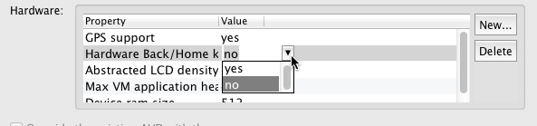
- Click outside the Hardware list to confirm the value change; make sure the value for Hardware Back/Home Keys is still displayed as No.
- Click Edit AVD.
- Run your test application again.
Genymotion emulator
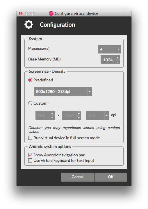
If you do not see the overflow menu when testing on a Genymotion emulator, you may need to enable the navigation bar.
To enable the navigation bar, the emulator must not be currently opened, then:
- Start the Genymotion app.
- Select the emulator you want to configure, then click Configure button
 .
.
- Enable Show Android navigation bar, then click OK.
- Run your test application again.
See also:
- Android Design: Action Bar in Android Design
- Action Bar in the Android API Guides
- Android Themes in the Titanium Guides
- ActionBar Titanium API Reference
- MenuItem Titanium API Reference