Introduction
The Appcelerator App Designer is an integrated WYSIWYG layout design tool for developing mobile applications using Appcelerator Titanium. App Designer features two views: Design and XML. The Design view allows you to have an editor view for both your design and layout while the XML views allows you to view your code.
In the Design view (App Designer editor), you will see two tabs (near the bottom): Design and XML. Clicking either of these tabs will toggle between the UI design view and your code. Modifying your app in either view will seamlessly update the content in the other view. There's no need to save changes in one view to see it updated in the other.
Three other views that are helpful to your app design workflow are the Properties, Elements, and the Outline views.
The Properties view is a context sensitive view of all properties available to the currently selected UI element. Once you have selected an element, you can make changes to the Properties view and immediately see the updates reflected in the Design view.
The Elements view is a list of all supported UI elements that can be represented in the App Designer editor. Left-select and drag any of the elements in the list and position the element in the App Designer editor.
The Outline view is a hierarchical tree of the currently active project. The Outline shows the relationship of parent and child elements and provides a quick reference point to your Titanium Style Sheets (TSS) associated with this view. Clicking on the TSS element/ID/class will open that TSS view in the Properties view so that you can edit the TSS properties directly. Selecting an element will display it's alterable properties in the Properties view as well.
Plan Availability
App Designer is available for Enterprise and Pro plans only. Currently, Appcelerator does not offer a free trial or Indie plans.
Studio Setup
A good way to get started with App Designer is to create a new Alloy project. This section will walk you through the basics of setting up a new Alloy project and get you familiarized with setting up Titanium Studio views commonly used with App Designer editor.
Before starting this guide, ensure that the App Designer plugin has been installed. If you didn't install it yet, please review Installing App Designer for instructions on installation.
- Let's start out by making a new Alloy project. From the menu bar, select File > New > Mobile App Project.
- Make sure the Default Alloy Project is selected and click Next.
- Enter a Project name and App Id and click Finish.
- Appcelerator's Test service may appear for this app. Click No to continue. We won't need the Test service for this project.
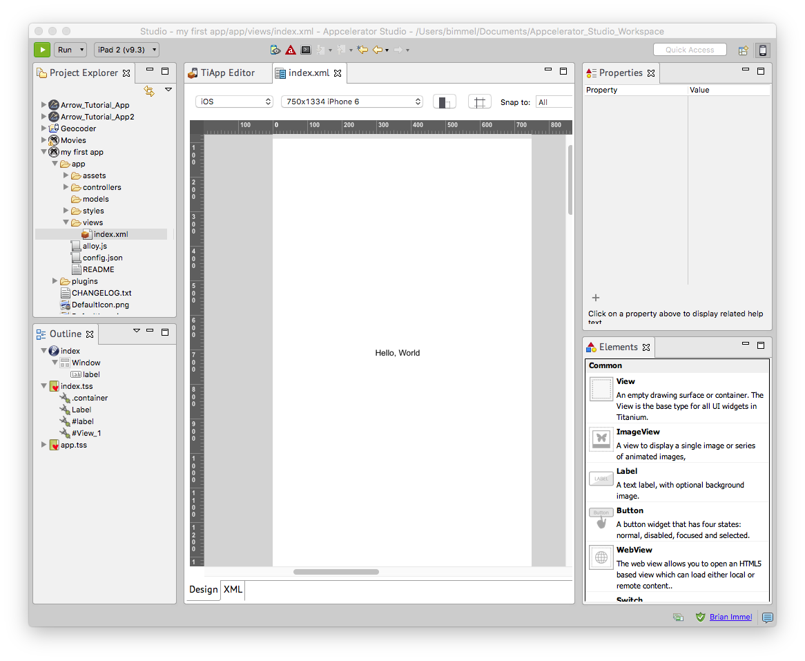
- With the project created and the Project Explorer view open, expand the following folders until you get to index.xml:
- Open the App Designer editor: click on the App Designer Perspectives button (found in the upper right corner of Studio). This perspective includes the following views: Project Explorer, Outline, App Designer editor, Properties, and Elements. If these views don't open, please following the instructions below to add them manually to your perspective.

Manually adding views to App Designer perspective
In the unlikelihood that toggling the App Designer Perspective button, doesn't open up the aforementioned views, or you are using a version of Studio prior to 4.6.0, the following steps will instruct you on how to add the common views necessary to work with App Designer.
If the Properties, Elements, and Outline views didn't open when you opened the index.xml file, follow these steps to open them:
- To launch the Outline view, go to Window > Show View.... In the Show View window, expand General, select Outline, and click OK.
- To open the Properties and Elements views, go to Window > Show View > Other... again, expand App Designer, shift-select Elements and Properties, and click OK.
Once you have these helpful views open, you can drag and drop the views that best assists your in your app design workflow. The image below shows a typical layout for using the Outline, Properties, and Elements views in conjunction with the App Designer design view.
Now you're ready to start designing and laying out elements, modify element properties, and tweak your design using a WYSIWYG environment but before we move on to that, let's take a moment to explore a new perspective (view set): App Designer editor.
Perspectives
As a quick reminder, a perspective is a pre-defined set of views that works best with one workflow or another. With the introduction of App Designer editor, we also introduce a new perspective just for App Designer.
By default, Titanium Studio launches with the Studio  perspective. To switch to a new perspective, click one of the perspective
icons found in the upper right corner. In the image to the right,
you see the new icon for App Designer perspective has been enabled. Before
working with App Designer, its recommended that you switch your perspective
to App Designer perspective.
perspective. To switch to a new perspective, click one of the perspective
icons found in the upper right corner. In the image to the right,
you see the new icon for App Designer perspective has been enabled. Before
working with App Designer, its recommended that you switch your perspective
to App Designer perspective.
To add the App Designer perspective to the Perspective toggle options,
- Click on the Open Perspective icon
 found in the upper right corner.
- Select the App Designer icon
 from the dialog window and click OK. This will launch the App Designer perspective with the additional views
of Properties, Elements, and Outline.
from the dialog window and click OK. This will launch the App Designer perspective with the additional views
of Properties, Elements, and Outline.
- Double-click on any Alloy view file to launch that project into the App Designer editor.
App Designer enabled
Creating and modifying elements
To get a feel for creating and modifying content in App Designer, let's explore the views by creating a few elements and modifying them using the various tools and features these views offer.
Modifying the background
In this short tutorial, we will modify the background of our app to have a red background color using the Outline and Properties views.
- In the Outline view, select the Window object.
- With the Window object selected, scroll down to Background in the Properties view until you find the Background property.
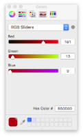
- Click on the BackgroundColor parameter to show it's current hex color values.
- Click the ... button to open a Color picker window.
- In the RGB Sliders option, set the following colors:
- Red: 181
- Green: 13
- Blue: 0
- Close the Color picker window to apply the color to the selected (Window) object.
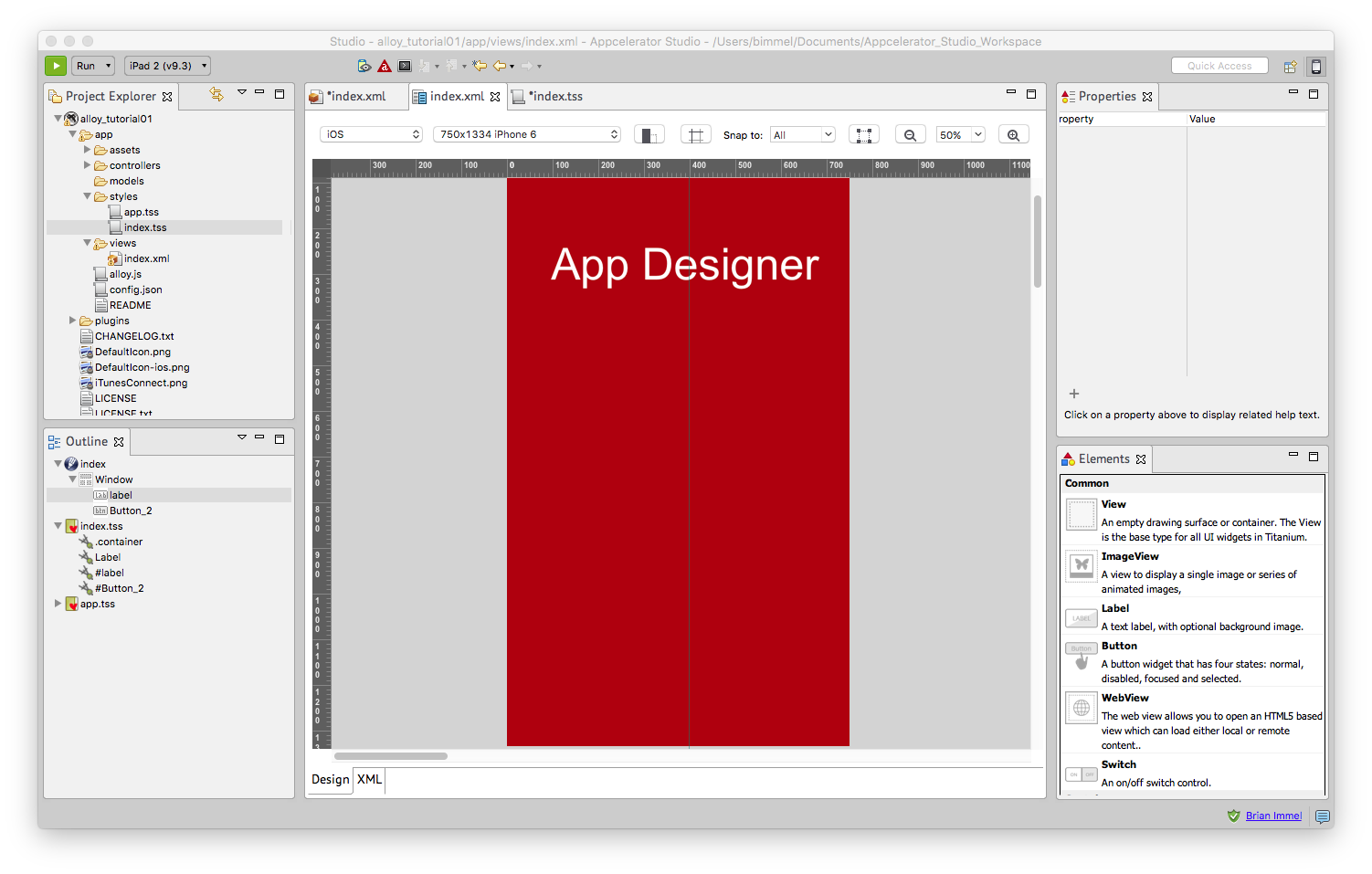
You should now have a red background to your app.
 Color picker
Creating a button
The following instructions will show you how to create a button element from the Elements view and modify various parameters using the Properties view.
- From the Elements view, select and drag a button element anywhere on the app's App Designer editor.
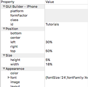
- With the newly created button element selected, rename the element by changing the id value in the Properties view. Change the id value to "Tutorials". You should notice that the name of the button element has now changed in the Outline view.
- Adjust the position of the button by changing the left and top parameters in the Position property in the Property view. Set the left parameter value to 30% and the top value to 25%.
- Next, change the size of the button element by adjusting the parameters found in the Size property. Under Size, set the height parameter to 5% and width to 18%.
- Finally, change the font size and font family in the font parameters found under the Appearance property.
- Set the fontSize to 14.
- Set the fontFamily to a family such as Arial. To see the font family change, you will need to click off that parameter.
- To make the button to look more like a button, change the rigid looking corners to a rounded corner. Under the Borders property, set borderColor to #b50d00 (using the Color picker) and borderRadius to 15.
- Finally, change the text of the button element by title parameter (under Appearance property) to display "Tutorials".
Now, let's give this button an action by modifying it's code via the XML view.
- Click the XML tab in the App Designer editor.
-
Change the following code:
<Button id="Tutorials"/> -
To this:
<Button id="Tutorials"onClick="loadTutorials"/>
Back in the Properties view, you will now see the click parameter (under Events) has a value of loadTutorials. The loadTutorials event hasn't been defined anywhere so it won't do anything. Defining that event is beyond the scope of this tutorial.
If all went well, you should now have a button element with text of "Tutorials".
 Window background properties and parameters
Creating a label
These steps will show you how to create a label element from the Outline view and modify it's parameters via the Properties view.
- From the Outline view, select the Window object.
- Right-click on the Window object and go to Quick Create > Create Label.
- Select the newly created label element.
- In the Properties view, modify the following parameters:
- id: App Designer
- Position
- left: 0
- top: 10%
- Size
- height: 12%
- width: 100%
- Appearance
- color: #ffffff
- font
- fontSize: 48
- fontFamily: Arial
- text (xml): App Designer
- textAlign: Titanium.UI.TEXT_ALIGNMENT_CENTER
We should now have a nicely positioned prominent title label for our app that reads App Designer. There are a bazillion properties, methods, and events you can apply to your elements. As you can see in the textAlign parameter, we used the text align property from the Titanium.UI.Label module. More UI label modules can be found in the Titanium.UI documentation.
Note: If a change in a parameter's value doesn't trigger a change to the displayed element, you may need to complete the value change by hitting enter or by clicking onto a different part of the window.
 Label element
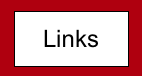
Copying an element
The following steps shows you how to copy an element via the Outline view and modify it's properties view the Properties view.
- Select the recently created button called Tutorials in the Outline view.
- Right-click and select Copy.
- Right-click on the Window object and select Paste. You should see a new element called Button_1.
- Next, let's modify this copied element. In the Properties view, make the following changes to the parameters of this new element:
- id: Links
- Position
- Remove the value listed in the left parameter.
- right: 30%
- Appearance
- title: Links
- Events
- click: loadLinks
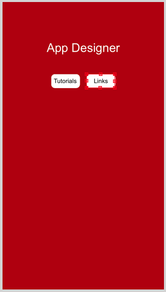
As you can see, creating a new element from an existing one and modifying it a bit is pretty quick. If everything went well in these tutorials, your app should look something like this:
Review
In this guide, we created a new Alloy project, learned how to add the new App Designer perspective, set up the Outline, Elements, and Properties views for commonly used workflows, and created and modified a few elements using both the Design and XML views.
 Copied button element